|
|
Describe the photos you took:
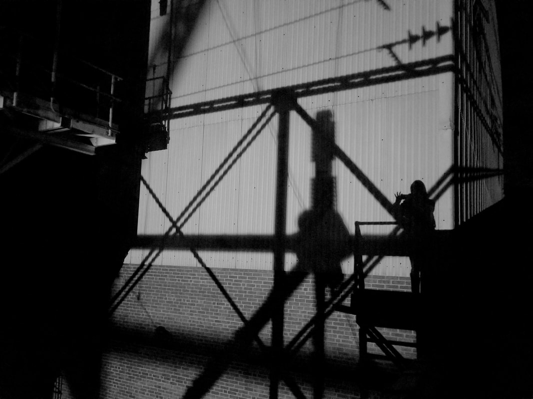
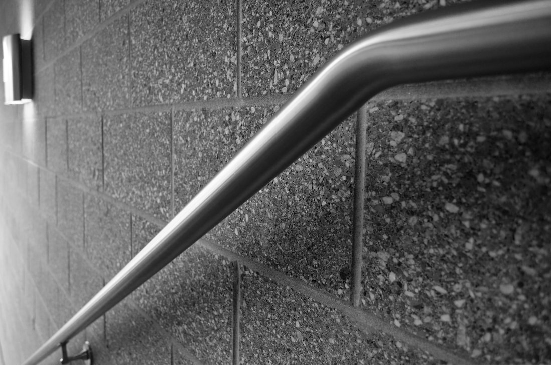
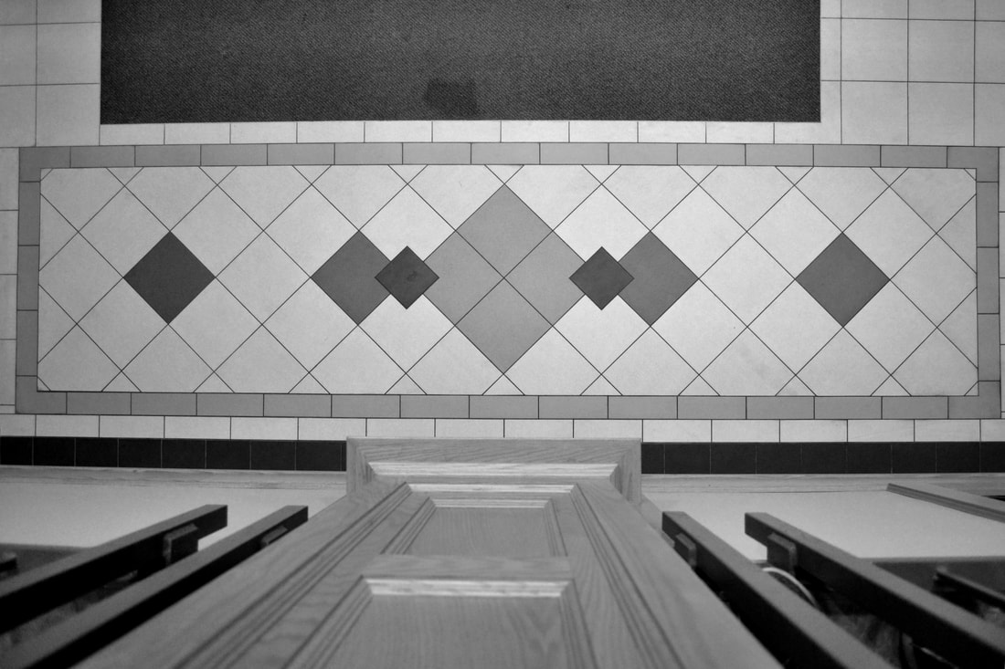
What is the distance in the shot? (How close or far away are you from your subject?) What was your point of view when you took the photos? (from above, below, straight on...) As we discussed in class, how did you "make the ordinary extraordinary?" Did you consider the rule of thirds to compose your shots? In which photos? Describe. Which one of of your photos is a dynamic composition that successfully leads the viewer’s eye through the work? For the third photo I took the shot up close. This allowed me to show more detail in the brick wall and the shadow that the railing cast upon it. For the fourth picture my point of view is looking straight down off of the balcony. In the first picture I made a seemingly boring wall become interesting because of the industrial shadows cast on to it. I used the rule of thirds on the first, second, fourth and sixth photos. The lines of the building and the shadows fall on the third lines, as does the railing in the second picture. I also lined up the line on the tile pattern with the third line and the edge of the lighting fixture hanging form the ceiling. The second photo from this set is the most dynamic. It draws the viewers eye directly into the center with the leading lines and a large amount of space on the sides which makes the image more pleasing and not too busy. |
|
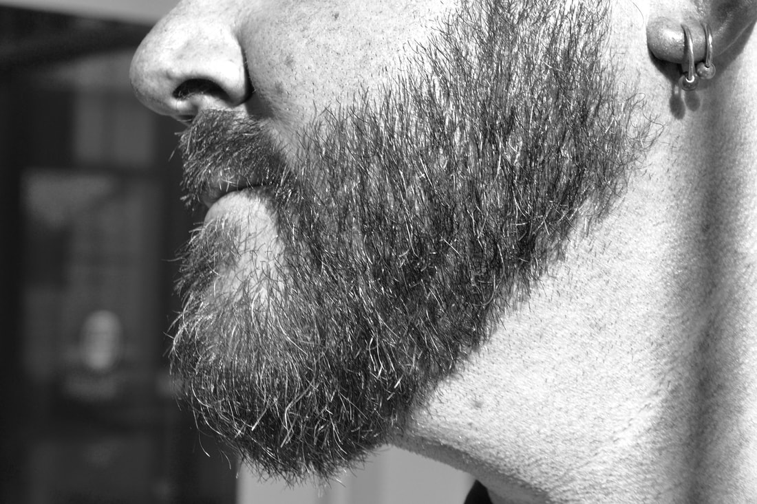
How did you move beyond subject matter and make your images deal with surface quality, not just the subject of the image? In the image of the beard, it is separated so that the texture and shape of the beard are disassociated from the face, and made into it's own object.
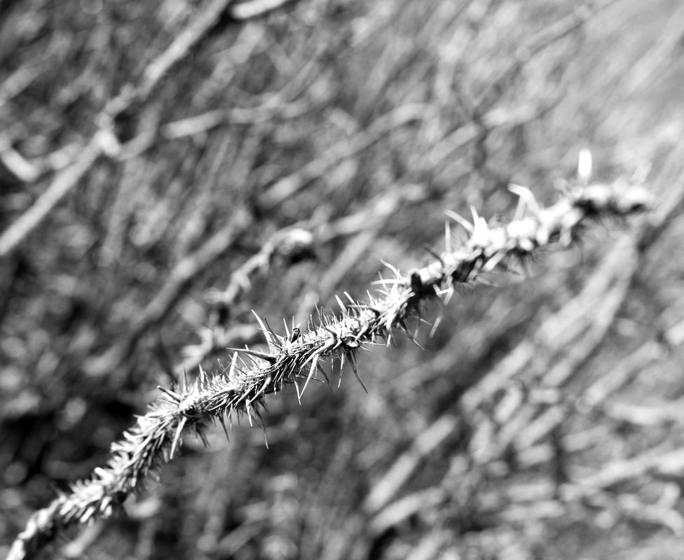
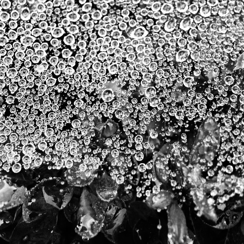
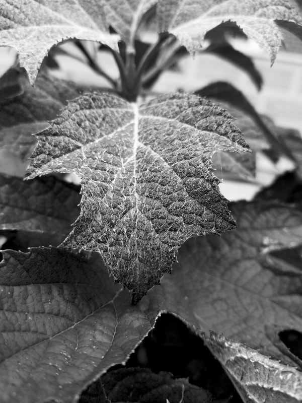
Which of your images do you feel is the most captivating? Do you feel the lighting conditions made an impact on the quality of the images? The image of the dew drops on the spider web is the most captivating, the lighting creates a gradient effect and high contrast, while the narrow depth of field creates an interesting and drawing effect. If you could shoot one of them over again, which one would it be and why? The photo of the leaf with hair on it, I would have lit it better do have more contrast between the foreground and background, and shot at a wider angle to show the other leaves to have the pattern of the leaves. |
|
|
|
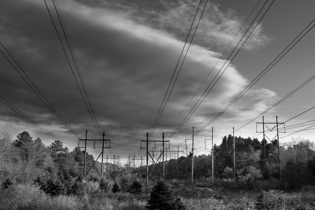
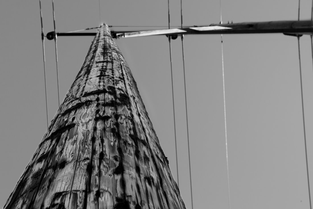
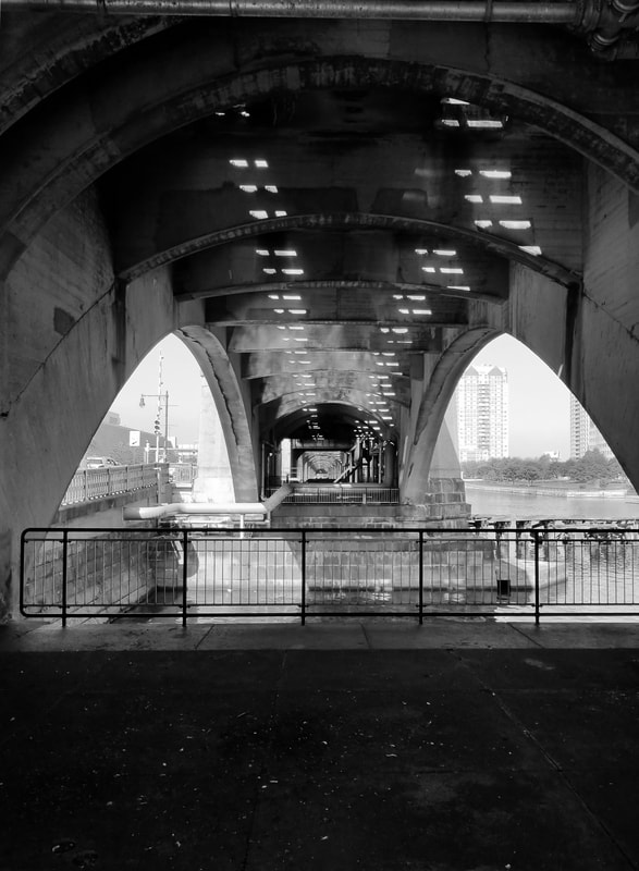
Did you consider the rule of thirds to compose your shots? In which photos? Describe. I considered the rule of thirds when composing my shots. The photo of the utility pole is lined up on the 3rd of the image, and so are the power lines. In the picture of the merry-go-round, the horizon is on the third.
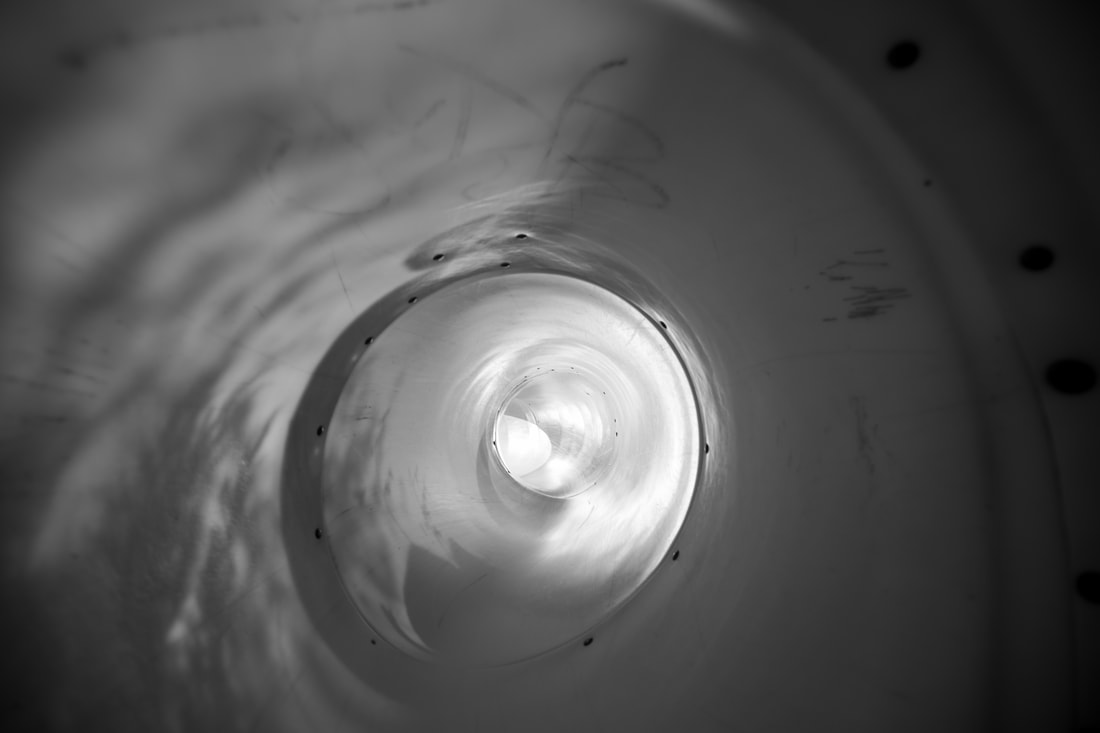
Which one of of your photos is a dynamic composition that successfully leads the viewer’s eye through the work? The photo of the slide leads the viewer's eye through the work. The light in the middle and the natural vignette help draw the viewer's eye into the center of the image, while the dead space gives the eye room to move around easily without noise and confusion. Which image do you feel contains the best play of organic and geometric shapes? The picture of the power lines has the best play of organic shapes; the clouds, rocks and trees, and geometric; the sharp edges of the power lines. Which image do you feel best satisfies the assignment? Why? I think the image of the power lines best satisfies the assignment. It has many guiding lines contrasting the nature of the image, and substantial dead space that makes the image easier to look at. There is a strong balance in the image and unity. |